
City Jersies? More like…..
0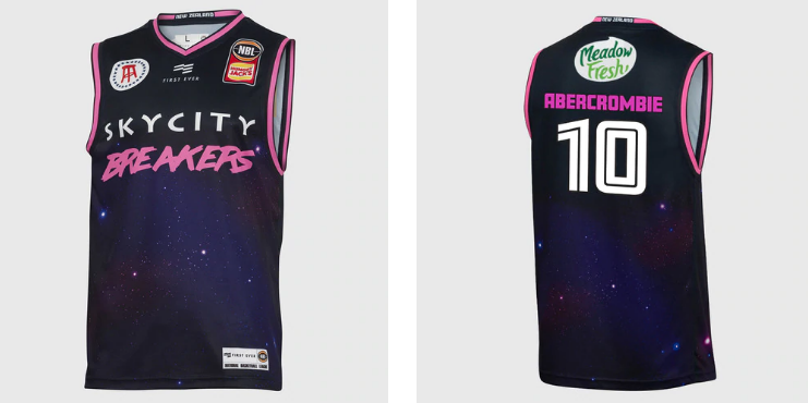 By Ryan Nixon
I don’t think 2018 was a great year for sporting uniforms. The Blues and Stormers got things rolling with a borderline farcical Super Rugby clash, no doubt because the traveling Blues didn’t think taking their home kit with them was necessary. Of course, their navy blue kit was almost identical to that of the Stormers’. Mitre 10 Cup organisers obviously missed this though, because barely a week went by without a fixture with clashing kits. Peak Mitre 10 Cup was then achieved when North Harbour elected to wear an alternative strip for charity, only for that change strip to create one of the worst clashes of the season. Rugby league did learn from union’s mistakes though, as New South Wales released their strips for 2019. Yes, strips, plural. A team that only ever plays against a team in maroon decided they needed two versions of their blue uniform, for a three game series. Football threw up their usual array of horrendous alternatives as well. So what will 2019 have in store? Well, it hasn’t started well.
The Australian NBL has decided to copy their American counterparts, with each team releasing a “City” edition jersey. With the brief basically being a jersey that represents a team’s city, the NBA has done this for the last two seasons, with mixed results. Some of the best ones have drawn on popular culture, with Miami’s neon pink and blue accented jerseys channeling Miami Vice, while Minnesota (Prince) and Brooklyn (Notorious B.I.G.) released jerseys inspired by local musicians. Memphis drew on their civil rights history with a politically charged jersey, while other teams like Utah, Washington and Denver reflected their local geography. Oklahoma used Native American motifs, Indiana motor racing, and the Bulls went with imagery from the Chicago city flag. There are lots of ways to represent your city in a jersey, and some can be powerful if done correctly. Which is why I’m writing this. The Breakers have sadly missed the mark.
Most of the Australian jerseys have hit the brief. Sydney, Perth and Melbourne all use elements from their city skylines, while Illawarra’s jersey is a nice throwback to the Illawarra Steelers rugby league team. The Breakers, with all of Auckland and New Zealand at their disposal for inspiration, have somehow given us a jersey emblazoned with the night sky and some pink writing. Of course, the accompanying release gave us some fluff about “New Zealand’s connection to the stars and the expansive night sky.” There was the usual mention of first to see the dawn, and a reference to Polynesian explorers. That’s all very nice, but how does this represent Auckland?
Or New Zealand?
Are we the only country with a night sky?
Do stars not shine anywhere else?
And what’s with that pink?
The sad thing is, there are plenty of directions the Breakers could have gone with this brief. The Auckland skyline or SkyTower could have been used, or the Harbour Bridge or Rangitoto. Navy blue and white colouring might have been a good way to go too. The Breakers seem to go out of their way to not want to be Auckland, but rather a New Zealand wide team. So why not use pohutakawa in the jersey, or other Kiwi flora or fauna. Someone should be able to look at this jersey and connect it with the region this team is representing. Instead, the Breakers put up an airball. These might be called city jerseys, but I’d describe them with a rhyming alternative.
Follow Ryan on Twitter